American Scientific
Four years of in-house design for a wholesale science supplier. The elephant mark reduced to one color and one weight, a sell-sheet system that absorbs whatever state the product data arrives in, an on-this-day social series, looping banners, and the company's e-commerce site rebuilt from scratch.
Rebrand
Before

After


The original mark was overdesigned in a specific and datable way. A character illustration with a black keyline. A rendered gradient on the body, a prop in the trunk, a hard-edged badge behind it, and the full company name curved around the ring, with two atoms tucked into the border in case the test tube had not made the point. It belonged to the era of design that produced it, and it fell apart at small sizes, which by then was most of where it had to live.
The obvious move was to kill it. That was not on the table. The founder was attached to the elephant, and the attachment had a reason behind it: the company had traded under that mark for a long time. A rebrand that opens by throwing away the one thing leadership cares about does not get approved.
So the elephant stayed and everything around it was reduced. The mark is now a single-value line drawing in one color. No fills. No keyline sitting separately from the art, no rendered gradient on the body, no second ring of type competing with the first. The ornament is still there, quiet enough now to read as texture. I adopted “am-sci” as the shorthand at the same time, which is what the company was already called out loud, and put the weight the old mark spent on ornament into one device: a gradient running red to blue across the letterforms.
I built the full AMERICAN SCIENTIFIC wordmark as an alternative lockup, carrying the same gradient. Some applications want the whole name. Mostly, though, it let leadership see the new system next to the old one and read it as continuity. Showing only the abbreviation would have made the change look bigger than it is.
The mark is not the interesting part of this project. Reducing an overdrawn logo is a known exercise, and any competent designer can do it. The constraint was the problem. Solve for a stakeholder’s real attachment to a specific piece of artwork, and do it without shipping something dated. Those two requirements pull against each other. The work was finding the version that satisfies both.
The company website, rebuilt
A B2B wholesaler whose site was guessing at a number its ERP already knew exactly.

A carousel, four tiles, and a 2020 catalog link still on the page.

Categories with live counts, and an account request as a first-class action.

The same category on the old site. A featured-products carousel, a plain list of subcategories, and an image that had stopped loading.

Physics and Physical Science, with a real count on every subcategory and one of them applied. Price sits behind sign-in, because price depends on the account.
The number nobody could produce
American Scientific is a wholesale distributor. Almost nobody pays list. What an account pays depends on its price level and on the quantity on the line, and NetSuite, the ERP the business is run on, holds all of that exactly.
The old site synced a base price out of NetSuite and threw the rest away. A pair of custom SOAP plugins pulled the matrix down. A WordPress plugin then re-derived each customer’s tier from their WordPress user role and applied a discount to the base figure. The role stood in for the price level, maintained by hand, in a second system, with nothing reconciling the two.
So the price a customer saw was a WordPress plugin’s reconstruction of a number that already existed, correct and authoritative, one API call away. A site that cannot state a price is a catalog with a phone number on it, and the ordering happens somewhere else.
What was actually running
Thirty-plus plugins, all depending on each other. The catalog, the faceting, the pricing and the ERP integration each belonged to a different one, so upgrading any of them meant first finding out what the other twenty-nine would do about it. None of them were upgraded.
The catalog ran off a NetSuite saved search called DO NOT DELETE. Nobody still at the company knew what was in it or who had built it. They knew the catalog stopped working without it.
By the end the backend data had stopped reaching the customer. Most of the product images no longer resolved and the sync meant to keep the listings current had quietly failed. Nothing alerted. It degraded until somebody noticed.
What replaced it
A Next.js application on Cloudflare Workers through OpenNext, with D1 as the catalog store. A second Worker owns the NetSuite integration and exposes it over an internal boundary. Nothing that touches the ERP runs in the same process as a page render.
The site now asks NetSuite for the price level on the account and resolves the real figure for the quantity requested. The WordPress user role does not exist in the new system.
The catalog is one SQL query, in version control. Somebody who was not there when it was written can read it and change it in a diff.
| Layer | Was | Now |
|---|---|---|
| Stack | WordPress + WooCommerce + FacetWP + a custom SOAP plugin pair, inside 30+ interdependent plugins | Next.js on Cloudflare Workers (OpenNext) with D1, and a second Worker owning NetSuite |
| Pricing | Base price synced out of NetSuite, tiers re-derived from WordPress user roles | The real NetSuite price level, resolved per account against the quantity on the line |
| Catalog | A NetSuite saved search named DO NOT DELETE that nobody could explain | One SQL query, in version control, readable in a diff |
| Credentials | NetSuite token-based auth keys hardcoded in PHP | Wrangler secrets, out of the source tree entirely |
| API auth | REST endpoints registered with no permission_callback | Gated. Guests get a 401 on anything that resolves a price |
The cutover
- 2,013
- Accounts migrated
- 2,371
- Redirects mapped
- 41
- Carts recoveredacross 100 line items, carried over from the old store
See it live at american-scientific.com (opens in a new tab)
Product sell sheets, built as a system. Every sheet has the same parts in the same places: the item number, the product shot knocked out in a circle, a short row of feature icons, the description, the what-is-included list, and the line telling the reader to contact their sales representative.
The parts arrive in wildly different states. Some products come with a clean studio shot and a paragraph of copy. Some come with a phone photo and a spec table. The layout has to absorb that without every sheet looking like a different person made it.


Social Media
Posts for the company's Instagram account, built around an on-this-day-in-history series: a moment from the history of science, illustrated as a single composed image, with the detail in the caption.
It is the one channel here that is not selling a product. The job is to be worth following. The image has to carry the idea on its own, at thumbnail size, in a feed.


Motion Graphics
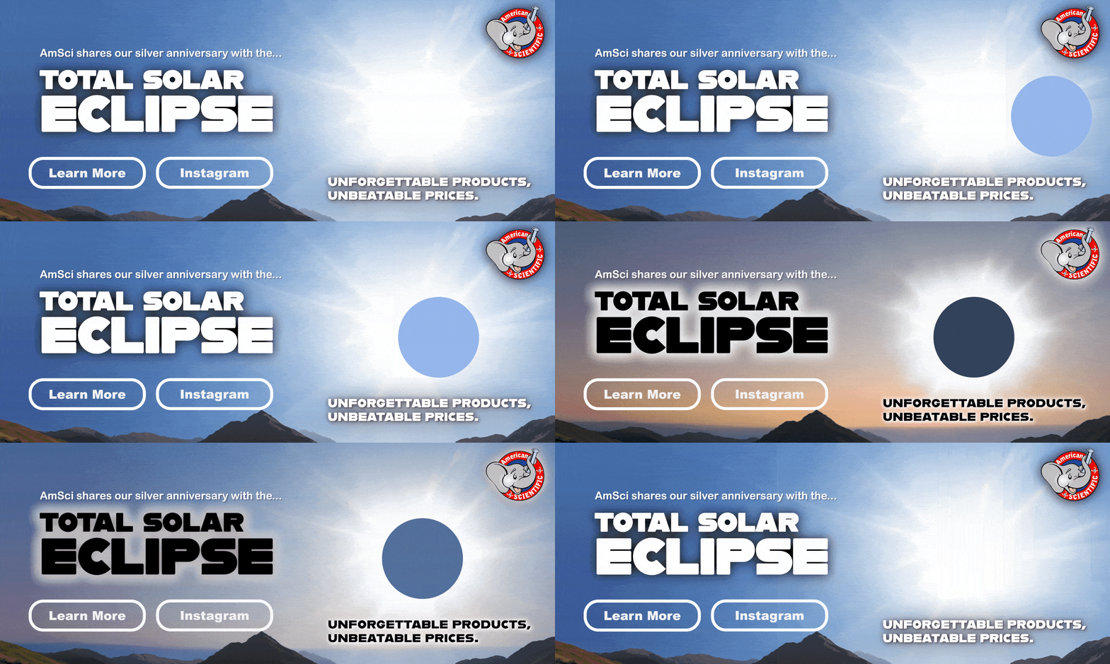
Short looping animations for social and for the site: logo builds, animated banners, and posts that move.
All of it has to survive autoplay with the sound off and read inside the first second, because that is the whole of the attention a looping banner gets. The loop point matters more than the animation.